CASE STUDY: HIGHLANDER GUIDES

hero img screenshot highlanders

.

A single, urgent call is what started my journey of building a website for Highlander Guides and Porters Association. It is a 20 years young community-driven organisation based in a relatively remote corner of Darjeeling. They were in need of a digital transformation. 


From our first conversation, the challenge was clear: they had several niche experiences but no way to communicate them. Their brand lacked the digital credibility to turn curious travellers into confirmed bookings.  My task was to piece together the fragmented stories and build a unified, trust-centered platform that translated their decades-long experience into a seamless user journey. 

.The Solution

To bridge the gap between their heritage and their digital presence, I implemented a three-pillar strategy.

A Story-Led Experience: I personally authored the site's narrative, transforming their technical services to stories that allow travellers to feel the trek before they book.

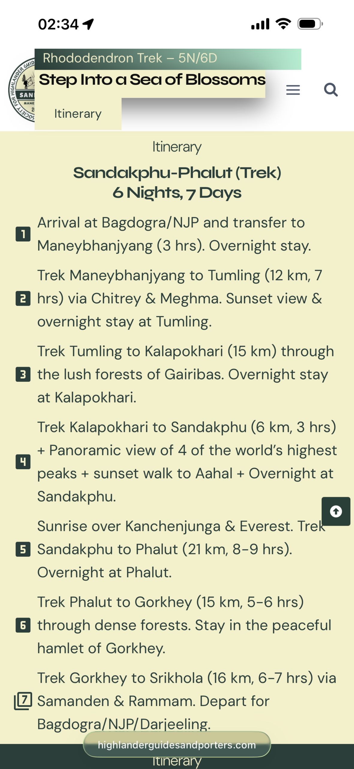
Operational Clarity: I simplified the booking journey by creating a single touchpoint and restructured their itineraries into digestible, user-friendly modules.

Purpose-Driven Design: I placed a spotlight on their "plastic-free" to magnify their commitment to responsible tourism as a USP, while highlighting their direct support for local guides and community development,

mobile view of one itinerary

Design & Visual Identity

To bring this digital transformation to life, I leaned into a vibe of Rugged Professionalism. I wanted the site to feel sturdy and dependable, yet feel adventurous and inviting.

The Atmosphere (Color & Texture):

I moved away from standard corporate aesthetics, and chose a palette that feels like a physical map in a trekker's hand:

Deep Forest Green (#263F39): A grounding shade used to establish immediate trust, showcase the verdant Singalila National Park and have a visceral connection to it.

Parchment (#F4F1C8): I replaced whites with this softer tone to evoke a calm, "vintage map" aesthetic, giving the user a sense of heritage and adventure from the first click.

Architecture & Typography:
Understanding that most trekkers would be accessing this information in the field, I prioritized a Mobile-First approach:

I utilized bold, high-contrast headings to organize dense data, ensuring that itineraries remain legible even on small screens and under direct sunlight.

Storytelling Through Imagery
Visuals were selected to balance the grandeur of the Himalayas with the warmth of its people:

The Scale: I curated high-impact, full-width landscapes from professional photographers for the hero sections (with the strategic exception for the home page), inviting users to "Escape the Ordinary."

The Heart: I balanced these vast landscapes with Human-Centric photography of tourists and local guides. This was a strategic move to humanize the brand and solidify community trust.

Respecting the roots: Working with a 20-year-old organization taught me how to modernize a brand without erasing its history. It’s about being a bridge between the old-world heritage and the new-world digital space.
Small details build big trust: I realized that for a trekker, knowing a brand is "plastic-free" or seeing the faces of the actual guides matters more than a flashy animation. Design is most powerful when it amplifies the brand’s heart.
Structure is a form of kindness: Navigating the Himalayas is hard enough; navigating a website shouldn't be. I learned that simplifying a complex itinerary is actually an act of empathy for the traveler.

Scroll to Top